TYPEFACE
CHICAGO TYPEFACE
What stood out the most about Chicago, compared to other typefaces, was its readability and adjustability in low resolutions, due to the spaces in between each pixel. The design of Chicago addressed this challenge by using generous spacing between each pixel, enhancing legibility, especially at smaller sizes. The font was designed to maximize clarity, ensuring that text remained readable even on the limited screens available at the time.
The readability of the font is further enhanced due to its bold, simple structure, with it being a sans-serif font with clean lines. This simplicity helped the characters appear clearly, which was essential for early digital displays with lower resolutions. The straightforward design also allowed the font to be rendered more effectively on screens with limited graphical capabilities, providing a smoother and more accessible user experience.
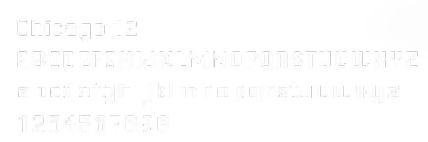
The font, rather than being monospaced, was proportionally spaced, meaning that the width of each character is proportional depending on the design of each letter. For example, when looking at a monospaced font, the letter “I” and “W” would be defined using the same unit of width, whereas with a proportionally spaced font, the characters would have different, individual widths, which allowed for better resizing and adaptability for the lower resolutions being used at the time to display the fonts.
This attention to both legibility and adaptability made Chicago a pioneering typeface in Macintosh systems interface design. It helped establish a new standard for digital typography, influencing the development of later system fonts and the design principles of modern operating systems and apps. Chicago remains a key example of how design can overcome technological limitations to enhance user experience.