MACINTOSH INTERFACE
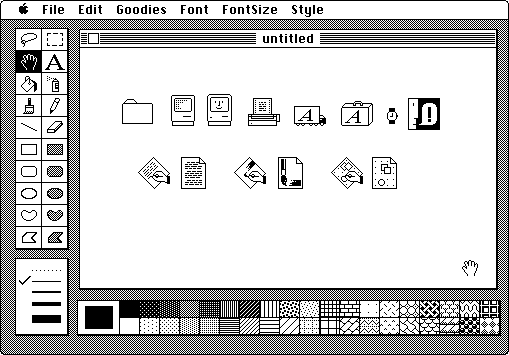
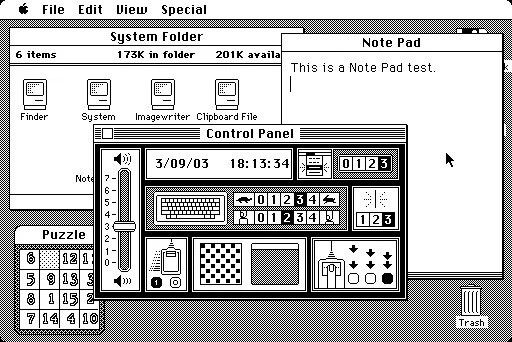
Susan Kare’s most significant contribution to the field of typography was the overall user interface of Macintosh systems. She created icons, typefaces, and layouts which very well depicted a simple, readable, interface, that is still partially used and looked at in today's designs. When creating the interface, Susan didn’t only focus on readability, she also helped form a comprehensive visual identity for the Macintosh systems, allowing it to become a more welcome, less complex interface in which users can just point and click on icons.
Included as part of her user interface creations, she made the typeface Chicago, which is arguably her most well-known piece of work. As described by Susan, “the goals were explained to me that it (the Macintosh) was a computer for people who were not computer literate so your mom could use it”. She had to make a typeface that was not difficult to read, while also taking in the limitations of the lack of resolution on the mediums at the time. The font curated the ability to be eligible at small sizes, as well as continuing on with the approachable, simple, look that Macintosh systems were going for at the time. Beyond Chicago, her work extended to a variety of other screen icons and fonts, shaping the early visual identity of Apple. Her designs were pivotal in transforming the way users interacted with technology. By thinking of type and icons as integral parts of the overall user experience, Kare helped to shift the focus from purely functional design to a more holistic approach that combined usability with personality. This was a significant departure from previous design philosophies, where typography was often considered secondary to function.