Susan Kare is a pioneer when it comes to creating pixel art, iconography, and user interface design. In the early 1980s, when the Apple Macintosh was being developed, most designers were focused on printed or technical graphics. Susan approached digital design from a more human-centered perspective. Instead of focusing on complexity or visual flair, she emphasized simplicity, clarity, and user comprehension. She believed that good design should feel intuitive, and that even in the medium she was working with, visuals could still be meaningful and expressive. Her ability to turn ideas into clean, comprehensible icons and fonts was revolutionary at a time when digital design was still new.
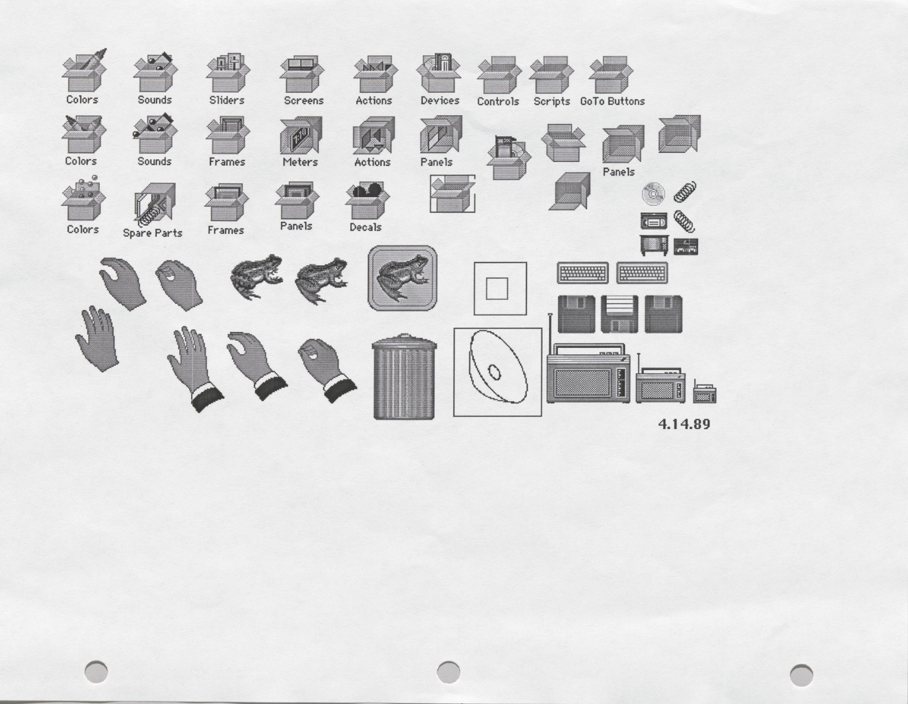
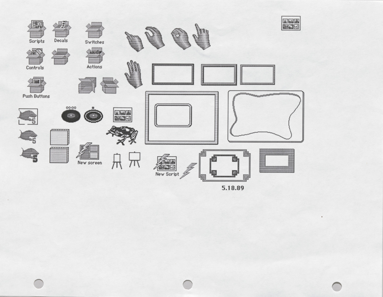
What set her apart from other designers at the time was designing within the tight technical limitations of early computer screens. The original Macintosh computer interface had a resolution of only 72 x 72 pixels per inch, as opposed to the current HD resolution we have now. The way computers looked back then was very pixelated, and did not have colouring or shading. Rather than viewing the resolution as a challenge, she took them as an opportunity. She created icons and typefaces with one pixel at a time, taking into consideration the placement of each dot while keeping in mind the potential readability of each design. Overall, her work helped define the simplistic and approachable tone that Apple became known for, making computers feel less intimidating and overwhelming, and easier to use. Her designs were functional, but also had a distinct personality to them. She brought a sense of simplicity and wit to screens that had previously been seen as overcomplicated to the average user.